
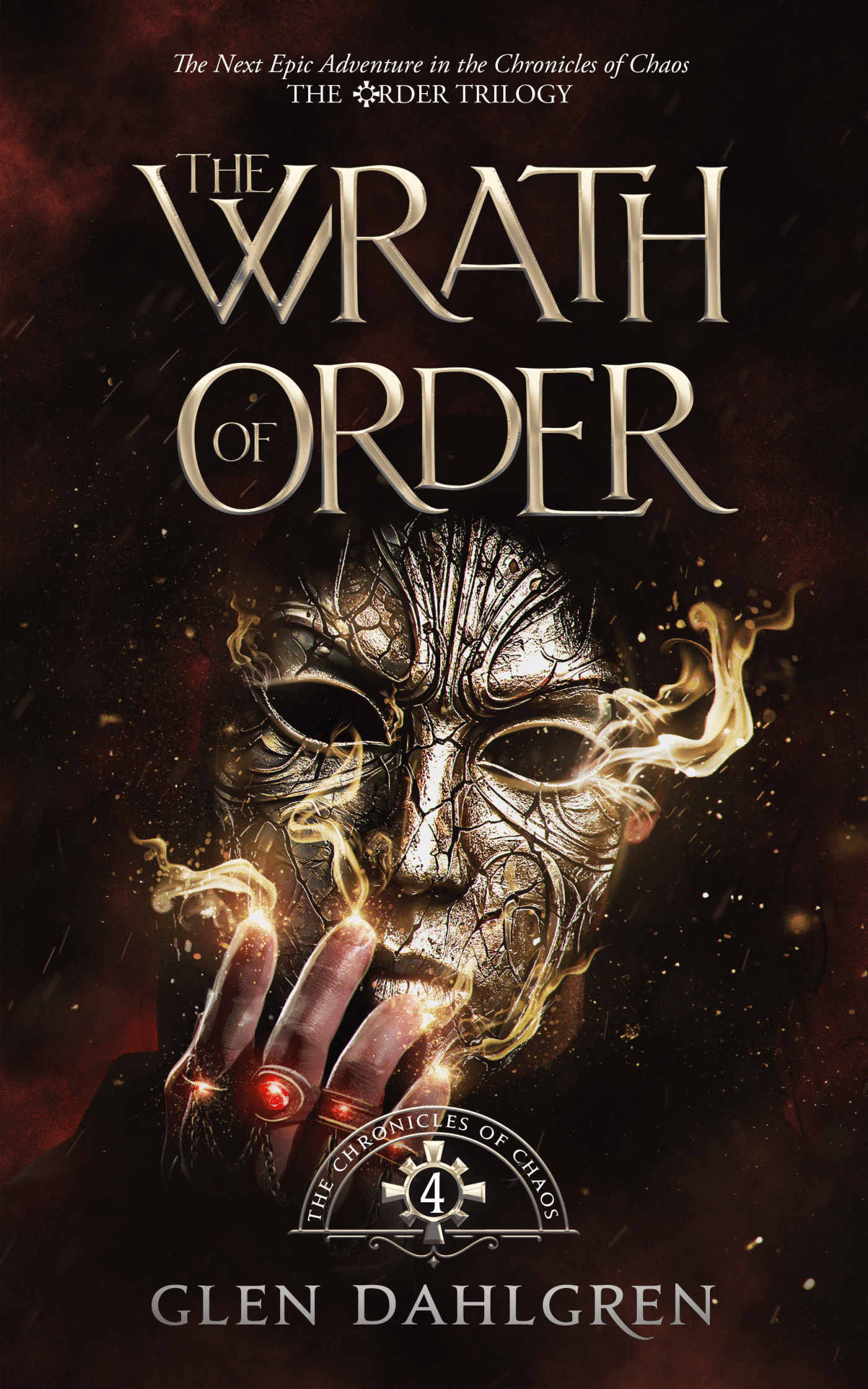
After months of working with the wonderfully talented folk at Miblart, I’m so happy to reveal the final cover for the Wrath of Order, the continuation of the Chronicles of Chaos and the first book in the Order Trilogy.
Responses among those that have sneaked a peek at it already have been overwhelmingly positive. Many say that the style is slightly different than the previous covers in the series, but they appreciate that it represents a new storyline in the Chronicles of Chaos. A stylistic difference wasn’t intended, but the interpretation is something I can get behind.
Everyone feels it’s arresting and compelling. People want to know what’s going on here, and I will admit that this is a scene from the book—and you won’t believe who is behind that mask. But that’s all I’ll say about that.
For now.
Unlike some of my other covers, this actually didn’t change too much from the original concept. I’ll just illustrate that with a few key deliveries to show how it evolved.
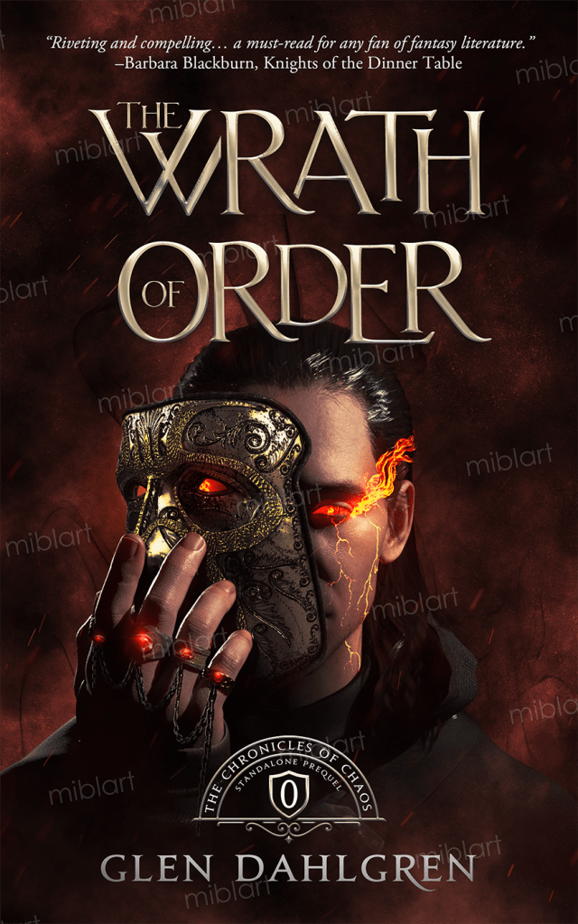
The first image tested the concept. I liked the idea, but wasn’t crazy about the specific mask, nor the fact that it showed a face. The series’ brand has always been a hand interacting with a magical object, not a person’s face. Here, the person was not only present, but was the focus. I wanted to showcase the mask instead.

In the second, the mask was much closer to what I wanted: an ancient metal artifact that looked both mystic and mysterious. However, the other parts of the image drew focus away from it, so I decided to enlarge the mask, fade the cowl more into the background, and add the expected magic effects.

Now, my covers all have single dominant colors. I thought red might work for this cover—as long as the color was distinguishable from the cover for the Child of Chaos. However, the red did not work. It, combined with the eye inside the mask, gave the cover a more horrific and creepy vibe than I was looking for.
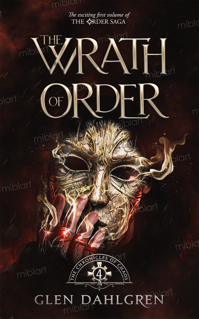
I decided to lean into the silver/gold color of the mask and make the dominant color for the magic be almost white. This shift worked really well, except this version almost whitewashed the mask and didn’t let the native detail shine through.

Once we’d moved the hand to show more of the mask, toned down the effects (although added more particles to them), shifted the eruptions of those effects to the contact points of the fingers (showing more intention), and finalized the series symbol (the starburst ring around the volume number), it was ready.
I couldn’t take my eyes from the final version and, once that happens, I know a cover has hit the mark. In fact, I kind of feel that this might be my favorite cover of the series, and that’s a high bar.
What’s even better, I got that final delivery just in time!
Today, I received an email from the Chanticleer International Book Awards, letting me know that their cover competition deadline is the end of July. After the Realm of Order’s multiple wins in April (including the Dante Rossetti Grand Prize), I was sad not to be able to enter WoO yet—but since its cover is complete, I could enter that!
Now I’ll be able to follow that contest’s progression at least and keep my fingers crossed that the judges enjoy this cover as much as I do.

I’d love to hear what you think of the final cover. Reach out and let me know!


Leave a comment